Our Emblem
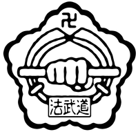
The emblem of the Korean Bulgyo Musool Association has had two distinct forms in its 48 year history. Originally, as one of our founders Grandmaster Lee Han Chul was a Chiefmaster in the Kuk Sool Won Hapkido movement, our logo reflected that collaborative association. The emblem was a moogunghwa (rose of sharon), the national flower of South Korea encapsulating a fist, holding a staff, flanked by two swords, with a banner beneath them. GM Lee added the distinct swastika (卍), an ancient symbol of the Buddhist religion to the top of the insignia, representing the role of spiritual cultivation at the forefront of the KBMA's practice.
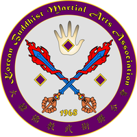
In 2015, to avoid confusion with the Kuk Sool Won tradition, which has an almost identical logo in wide use (trademarked in 1974), our third President and Grandmaster re-envisioned our Association's insignia, and thus our current emblem was born.
The explanation is as follows:
-The colors gold and purple throughout the emblem are representative of higher spiritual development, and the majesty of our tradition.
-The circle represents the earth, and being firmly rooted in "just this" reality. Further it symbolizes the elliptical arcs through which the body and all things in the universe find motion. The circle further represents samsara, cyclical experience that must be realized as non-different from nirvana (enlightenment) itself.
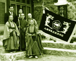
-The English and Chinese characters are the top and bottom of the logo, represent the union of east and west, the honoring of our time and place, as well as our history and roots. The year 1968 of course represents our founding at Jogyesa temple in Seoul, South Korea.
-The background inside of the circle is light gray, which is symbolic of the "great round mirror" of Zen, that is, the absolute/sunyata and reality itself reflected just as it is, specifically through the mode of martial arts as a somatic vehicle of Zen.
-The swords in the original logo where replaced here by two crossed swords (representing defense, rather than attack), in the form of Manjusri Bodhisattva's flaming diamond swords, which are symbolic of discriminating wisdom, and the cutting away of illusion in all ten directions. The handles of the swords, are of course vajra/dorje, the weapon of Indra that became a Buddhist liturgical instrument, which represent that our spiritual practice is firmly rooted in the somatic vehicle of martial arts.
-The fist in the original insignia, became an open palm in this new emblem. The meaning implied here is twofold, first and foremost it represents Abhaya Mudra, the gesture of fearlessness, reassurance, and safety, which dispels fear and accords protection and bliss. Further, it represents the palm striking tradition of Korea's Buddhist temples, that was resurrected by the co-founder of our association, Master Lee Han Chul. The spread fingers are also the gesture of "sohn sahl li ki" which is said to energize the hands, so this also represents energized, live, practice. The open palm rather than a fist implies defense, openness and potential.
-The three diamond shapes represent of course, the Ti Sarana or triple gem of Buddha, Dharma, and Sangha. In this, Buddha is represented on the left side of the logo, the side of the heart. The dharma is then nestled in the open palm, symbolizing the realization of the dharma through our somatic practice, and the sangha is on the right. The diamond shapes further are a subtle nod to the insignia of Daito Ryu Aikijujutsu, which was essential in the re-formation of Korean temple martial arts after 1945 (the liberation from Japanese occupation).


